
Blow Off Top
Why the S&P 500 Is Entering Its Most Dangerous Phase


“Can’t repeat the past?…Why of course you can!”
- F. Scott Fitzgerald, The Great Gatsby
In the late 1920s, New York felt unstoppable.
The skyline was rising, jazz spilled out of packed clubs, and on Wall Street, fortunes were being made faster than anyone thought possible. Nights stretched longer, money moved faster, and a quiet sense of permanence began to settle in.

It was an era of spectacle. Steel cathedrals of capitalism climbed into the skyline, champagne flowed, lights burned deep into the night, and wealth… real or imagined… seemed to multiply with effortless ease. It was a world sustained as much by belief as by balance sheets.
But this prosperity wasn’t evenly shared.
To be truly wealthy in the Roaring Twenties meant controlling capital. Industrialists like Henry Ford and financiers like J. P. Morgan sat at the center of an expanding economy, where income and opportunity flowed disproportionately to the top.
By 1928, the top 1% of U.S. families had wealth equating to a third of the entire distribution, while a large share of households lived near subsistence.
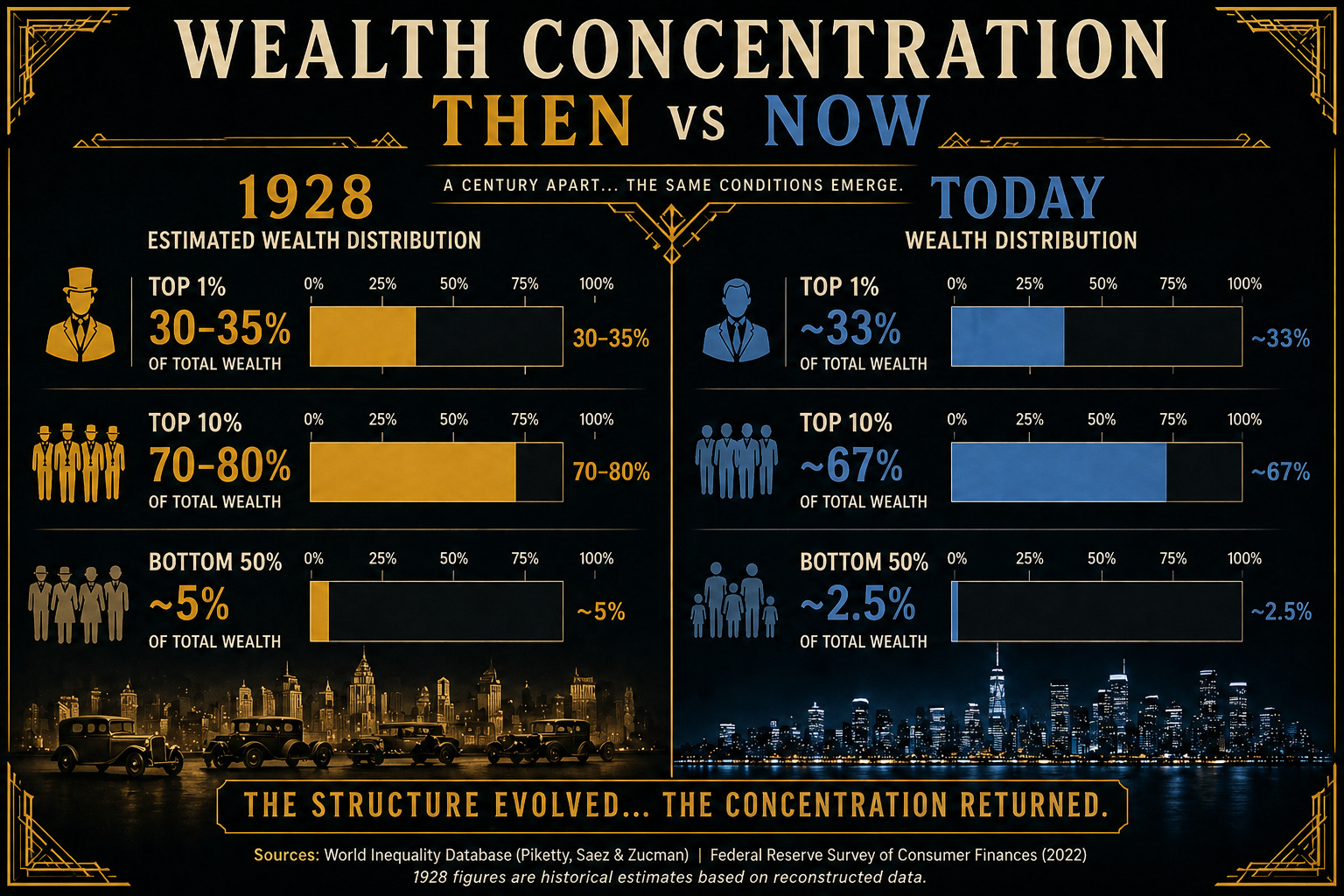
Today as well, the top 1% now controls roughly one-third of all wealth in the United States, while the bottom half owns an even smaller fraction of total assets.
The skyline has changed… but the concentration hasn’t.
And when wealth is tied to financial assets, rising markets don’t just reflect the system… they reinforce it.
And yet, that didn’t stop the speculation of the Roaring Twenties.
It wasn’t just professionals anymore. Taxi drivers, shopkeepers, and office clerks were all in the market. Stocks weren’t just investments… they were a path to something bigger.
For many, gains began to outpace income… turning speculation into a perceived necessity.
There’s a story often told about Joe Kennedy.
At the height of the market’s rise, he was said to have received a stock tip from a shoeshine boy. His takeaway wasn’t excitement… he took it as a signal that the market was nearing its peak.

“When the shoeshine boys have tips, the stock market is too popular for its own good.”
It wasn’t an isolated observation. Similar stories surfaced across the era. Even John D. Rockefeller is said to have noticed the same shift… when his everyday conversations with taxi drivers began to revolve around stock tips, he took it as a sign that the cycle was nearing its limit.
The modern version doesn’t look like a shoeshine stand.
Today, it shows up in different forms… young uber drivers placing leveraged bets on crypto, sports outcomes, and prediction markets like Polymarket, drawing attention far beyond traditional finance.
And in many ways, the speculative edge of crypto echoes the bucket shops of the 1920s—fast-moving, highly leveraged environments where price is driven as much by belief as by fundamentals.
The form has changed. The psychology hasn’t.
And over time, something begins to shift culturally.
Excess becomes entertainment. Risk becomes identity.
Speculation moves from the edges of the system to the center of it.
Markets don’t just rise… they accelerate. Gains compress into shorter timeframes, participation broadens, and risk becomes harder to see… not because it disappears, but because it feels like confirmation.
It’s no longer just a bull market.
It’s a blow-off phase.
Looking back, the signs always seem obvious. But in the moment, it feels like a new era… one where the old rules no longer apply.
Today, the conditions are not identical. But the human behavior is close enough to recognize.
And if that’s the case, the question isn’t whether this resembles the past…
but how close we are to the moment when it begins to resolve.
Because not all rallies are created equal.
Some are built on expanding fundamentals… others are driven by liquidity.
And then there is the final phase…
when price begins to detach from both… liquidity and fundamentals.
Detachment From Reality
To understand where we are in the cycle, price has to be viewed relative to its anchors: base money, liquidity, profits, risk perception, and credit.
When markets move in line with these anchors, trends are sustainable. When they detach, instability builds.
Right now, we’re seeing early signs of that detachment across multiple dimensions.
📊 S&P 500 vs Currency in Circulation
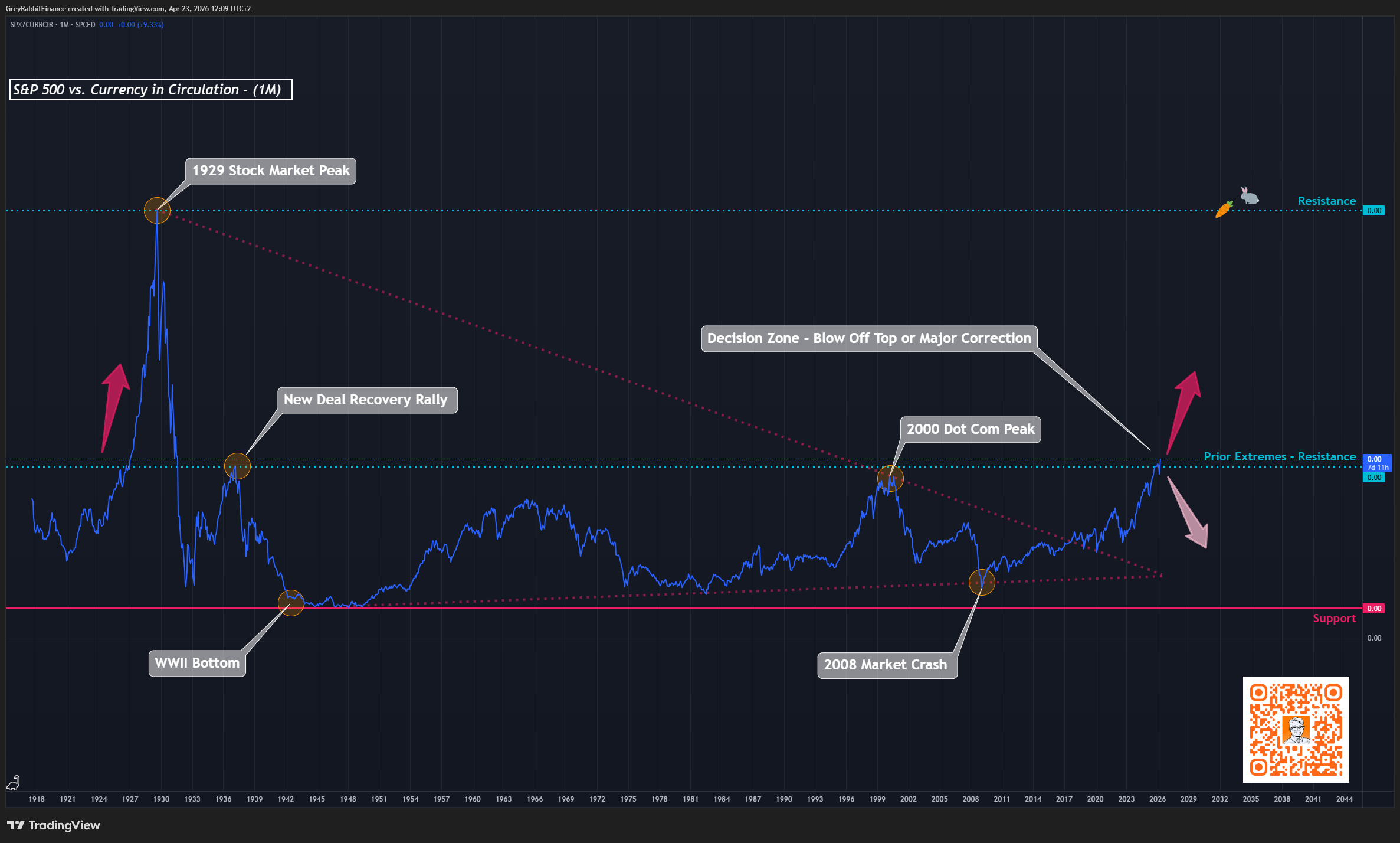
Question this chart answers:
How far have markets stretched relative to the underlying money in the system?
This chart compares the S&P 500 to currency in circulation… the base layer of money in the system.
Unlike liquidity measures such as M2, currency grows slowly over time. It represents the underlying monetary foundation against which financial assets ultimately expand.
When this ratio rises, it means financial assets are growing faster than the base money supply. In practical terms, markets are becoming increasingly detached from the monetary foundation of the system.
Historically, this type of expansion has only occurred during late-stage cycles. The peaks in 1929 and 2000 both coincided with periods where financial assets had significantly outpaced the growth of currency itself.
Today, we are once again approaching those same levels.
This creates a clear decision zone. Either markets begin to revert back toward the underlying monetary base, or the divergence continues… resolving through acceleration.
If the latter occurs, it would not represent a normal extension of the cycle, but a terminal phase… one where financial assets rapidly expand relative to base money, often in response to growing pressure within the monetary system itself.
At those extremes, market cycles have not simply reset… they have coincided with shifts in the underlying monetary framework.
We may now be approaching a similar point, where a final blow-off phase in financial assets unfolds alongside the conditions that force a broader reset of the global monetary system.
Currency represents the slow-moving foundation of the system. It expands gradually and anchors long-term valuation.
M2, by contrast, reflects liquidity—faster-moving money that responds to policy, lending, and economic cycles.
In simple terms:
Currency shows how far the system has stretched.
Liquidity shows how fast that stretch is happening.
If a blow-off phase emerges, it won’t be driven by currency… it will be driven by liquidity.
📊 S&P 500 vs M2 Money Supply (Global Liquidity)
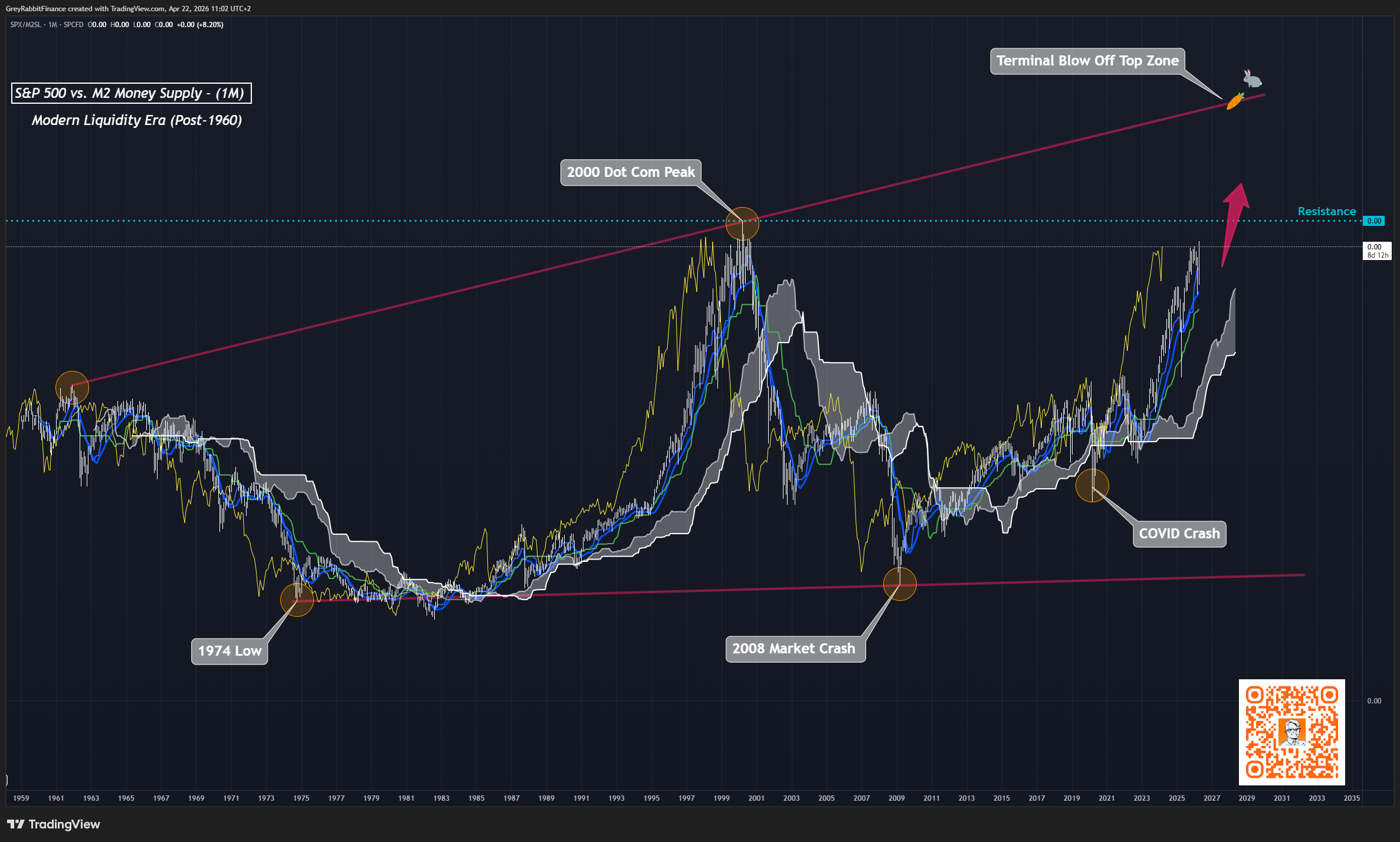
Question this chart answers:
Are markets rising in line with liquidity… or faster than it?
This has been the primary driver of modern markets.
Liquidity has explained the majority of upside since 2009 and continues to expand over time. But recently, price has begun to outpace that expansion.
Markets are still rising with liquidity…
but they are now accelerating faster than it.
When this chart rises, it means the S&P 500 is outperforming liquidity growth. In simple terms, markets are beginning to run ahead of their fuel.
Early in a cycle, this reflects strength. But as the move extends, it signals increasing stretch… where price is driven less by new liquidity and more by positioning, momentum, and expectations.
High inflationary environments tend to amplify this dynamic. As purchasing power erodes, capital is pushed out of cash and fixed income and into risk assets. Liquidity continues to grow, but expectations of future debasement accelerate even faster… causing markets to front-run liquidity itself.
This is where behavior shifts. Markets transition from valuation-driven to flow-driven, and moves begin to compress into shorter timeframes and steeper advances.
This dynamic is now unfolding at a critical point for both liquidity and market positioning, making this one of the most important charts to watch right now.
If it continues, the next phase is unlikely to be gradual. It would take the form of a blow-off move… one that carries major implications not just for equities, but for the broader market and crypto as well.
📊 S&P 500 vs Corporate Profits
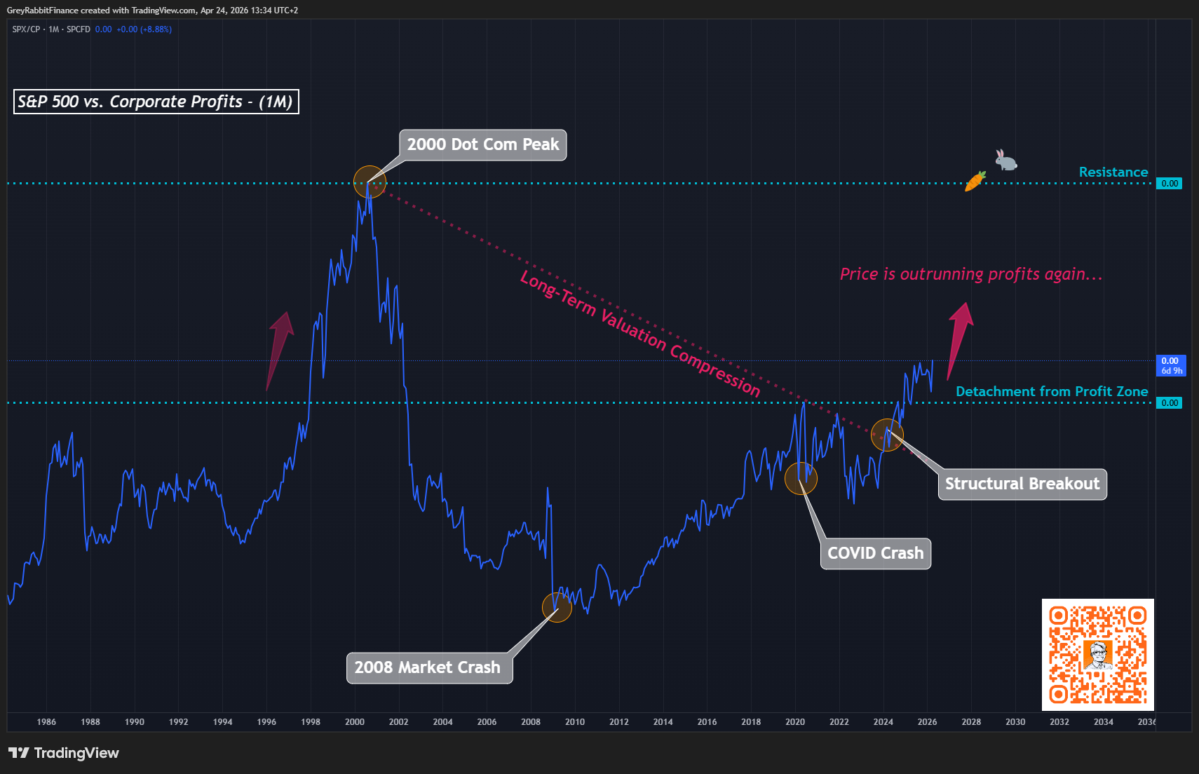
Question this chart answers:
Are rising prices supported by earnings… or breaking away from them?
This chart compares the S&P 500 to corporate profits… the fundamental earnings base that supports valuations.
When this ratio rises, it means price is increasing faster than profits. In simple terms, valuations are expanding.
Following the 2000 peak, valuations entered a long period of compression, where price and profits gradually realigned over time.
That structure has now broken.
The recent move marks a clear shift away from that compression phase, with price once again beginning to outpace underlying earnings.
This suggests that the current advance is being driven less by fundamental growth, and more by expansion in multiples… an environment that typically emerges in the later stages of a cycle.
In the context of rising liquidity and broader structural extremes, this type of break often signals not the beginning of a move… but the transition into its final phase.
📊 S&P 500 vs VIX (Risk Appetite)
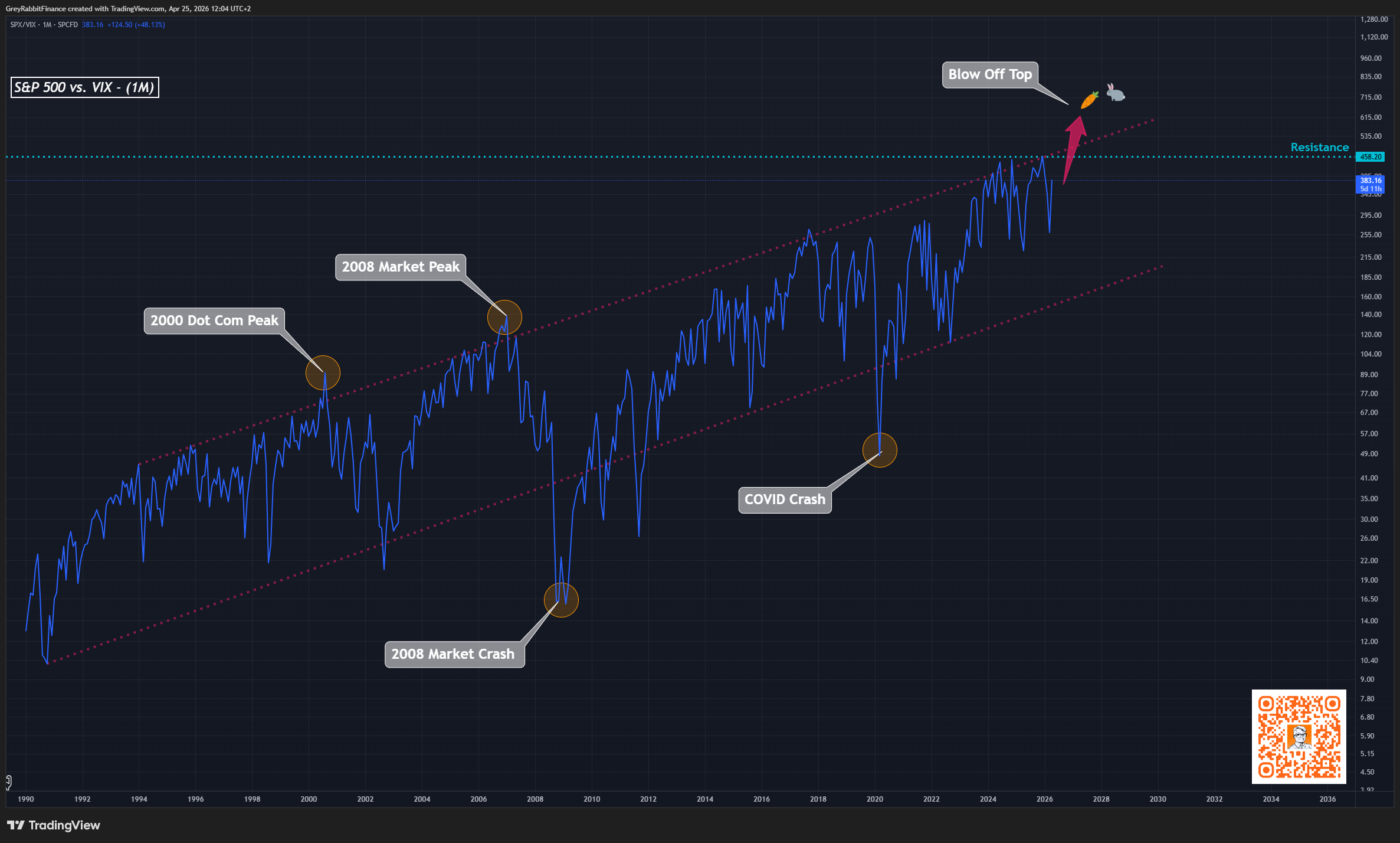
Question this chart answers:
Is the market becoming increasingly complacent as it rises?
Every major top shares one trait: no perceived risk.
When this ratio accelerates, volatility is suppressed, positioning becomes crowded, and downside hedging disappears.
In simple terms, price is advancing with less perceived risk… a condition that typically appears late in a cycle.
📊 S&P 500 vs Credit (Confirmation Layer)
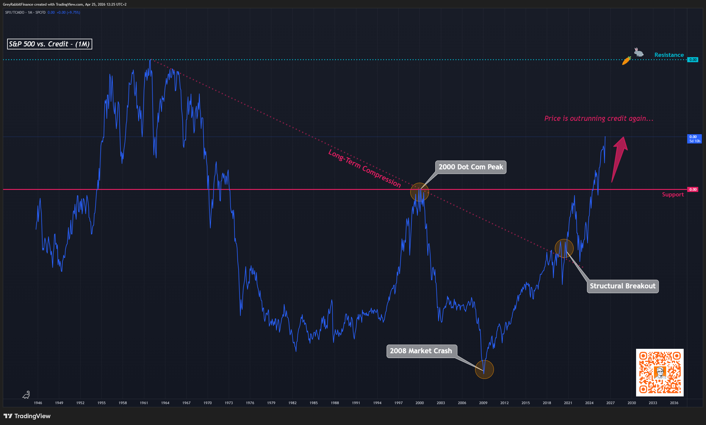
Question this chart answers:
Is the market being supported by credit—or moving ahead of it?
This chart compares the S&P 500 to total credit in the system.
When it rises, equities are outperforming credit expansion… meaning price is advancing faster than the underlying financial support.
Early in a cycle, this can reflect strength. But as the move extends, it signals increasing detachment from the credit cycle… a dynamic often seen in the later stages of a market advance.
🧠 The Synthesis: When All Anchors Break
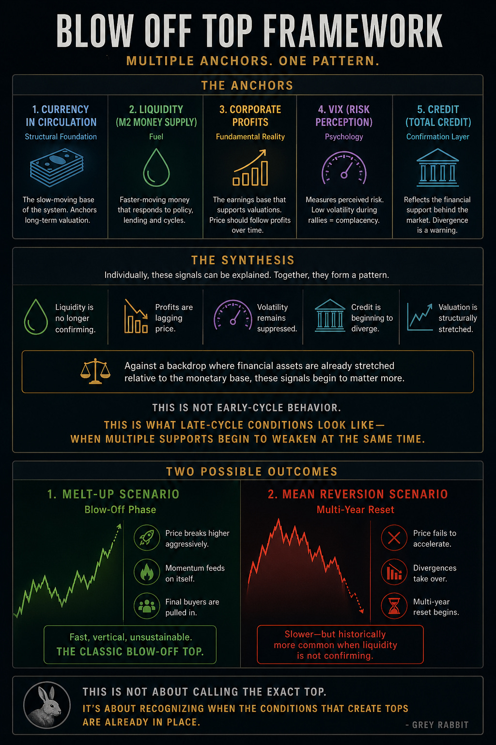
Individually, each of these signals can be explained.
Together, they begin to align.
Liquidity is no longer confirming.
Profits are lagging price.
Volatility remains suppressed.
Credit is beginning to diverge.
Against a backdrop where financial assets are already stretched relative to the monetary base, these signals begin to matter more.
This is not early-cycle behavior.
This is what late-cycle conditions look like… when multiple supports begin to weaken at the same time.
⚡ Two Possible Outcomes
From here, markets tend to resolve in one of two ways:
1. Melt-Up Scenario
Price breaks higher aggressively
Momentum feeds on itself
Final buyers are pulled in
This is the classic blow-off top
→ fast, vertical, unsustainable
2. Mean Reversion Scenario
Price fails to accelerate
Divergences take over
Multi-year reset begins
This is slower—but historically more common when liquidity is not confirming.
📊 S&P 500 (Two Scenarios)
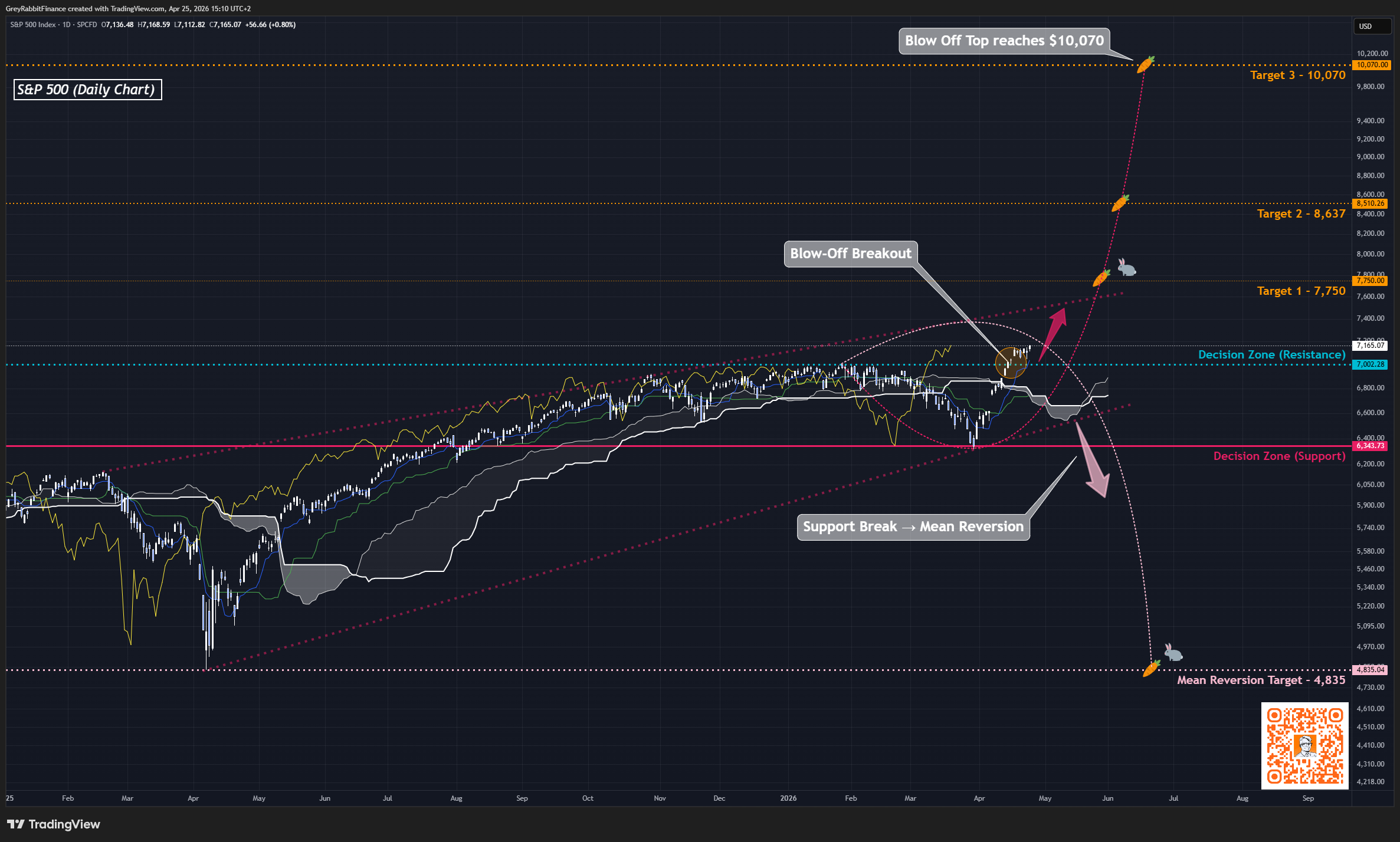
Question this chart answers:
How could this cycle resolve from here?
This chart outlines two potential paths for the S&P 500.
The first is a breakout into a blow-off phase… where price accelerates beyond resistance, potentially reaching higher targets in a compressed and increasingly volatile move.
The second is a rejection at resistance, followed by a break of support, leading to a broader mean reversion without a final expansion.
In more extreme inflationary conditions, the first scenario can accelerate even further, as capital is pushed out of cash and into markets… fueling a faster and more unstable end to the cycle.
Final Thoughts from the Rabbit Hole 🐇
There’s a deeper layer to all of this… one that doesn’t show up on price charts alone.
Markets today are no longer anchored purely to production, earnings, or even traditional money supply. They are anchored to expectations of liquidity.
Not liquidity itself…
but the belief that it will always be there when needed.
That belief is what allows valuations to stretch, risk to compress, and positioning to crowd.
A blow-off top is not just a technical event.
It’s a psychological one.
It’s the moment when the market stops asking what something is worth… and begins to assume it will always go higher.
At that point, price is no longer discovering value.
It is reflecting consensus.
And consensus, at extremes, is fragile.
Because when everyone is positioned the same way, the system loses flexibility. There are no marginal buyers left—only participants waiting for continuation.
That’s why blow-off tops don’t unwind gradually.
They don’t correct politely.
They break.
Not because something new happened…
but because the imbalance was already there.
Markets are never entirely new. Each cycle feels different while it’s happening… more advanced, more justified, more permanent. But the structure beneath it—the behavior, the excess, the belief—echoes what came before.
We move forward in price…
but the pattern pulls us back.
“So we beat on, boats against the current, borne back ceaselessly into the past.”
The goal is not to call the exact top.
The goal is to recognize when the conditions that create tops are already in place.
And increasingly, they are.
We may now be approaching a similar point… where a final blow-off phase in financial assets unfolds alongside the pressures that force a broader reset of the global monetary system.
Stay Vigilant,
—Grey Rabbit
P.S. These conditions don’t resolve all at once… they unfold over time.
If we are entering a blow-off phase, I’ll be tracking it week by week with my macro market report. Subscribe below to follow along.
This is one of the best and most insightful posts I have read in years. I don't always agree with Grey Rabbit's posts but in this case I believe he has hit the nail on the head.
"Markets don’t just rise… they accelerate. Gains compress into shorter timeframes, participation broadens, and risk becomes harder to see… not because it disappears, but because it feels like confirmation." The greatest expression of what happened during the 1929 Wall Street Crash. Only thing is its happening now. Keep up the great commentary! Pearse.
The convergence of RSI extremes with put/call compression is worth taking seriously even if you're structurally bullish -- it's not a timing signal but it does argue for tightening stops on extended names rather than adding exposure. The piece I keep coming back to in blow-off setups is the leadership rotation: in 1999 you saw the S&P peak while small-caps had already been in a stealth bear market for 18 months.